Mahindra Humanities Center
The Mahindra Humanities Center organizes a host of interdisciplinary events and seminars each month during the academic year, inviting influential speakers like Toni Morrison, Steven Spielberg, and Herbie Hancock.
Between September 2013 and December 2013, I began to track and record support calls about the Center’s website. As a result, between April 2014 and May 2014, I strove to learn about and better support the needs and goals of the Center’s audience and community.
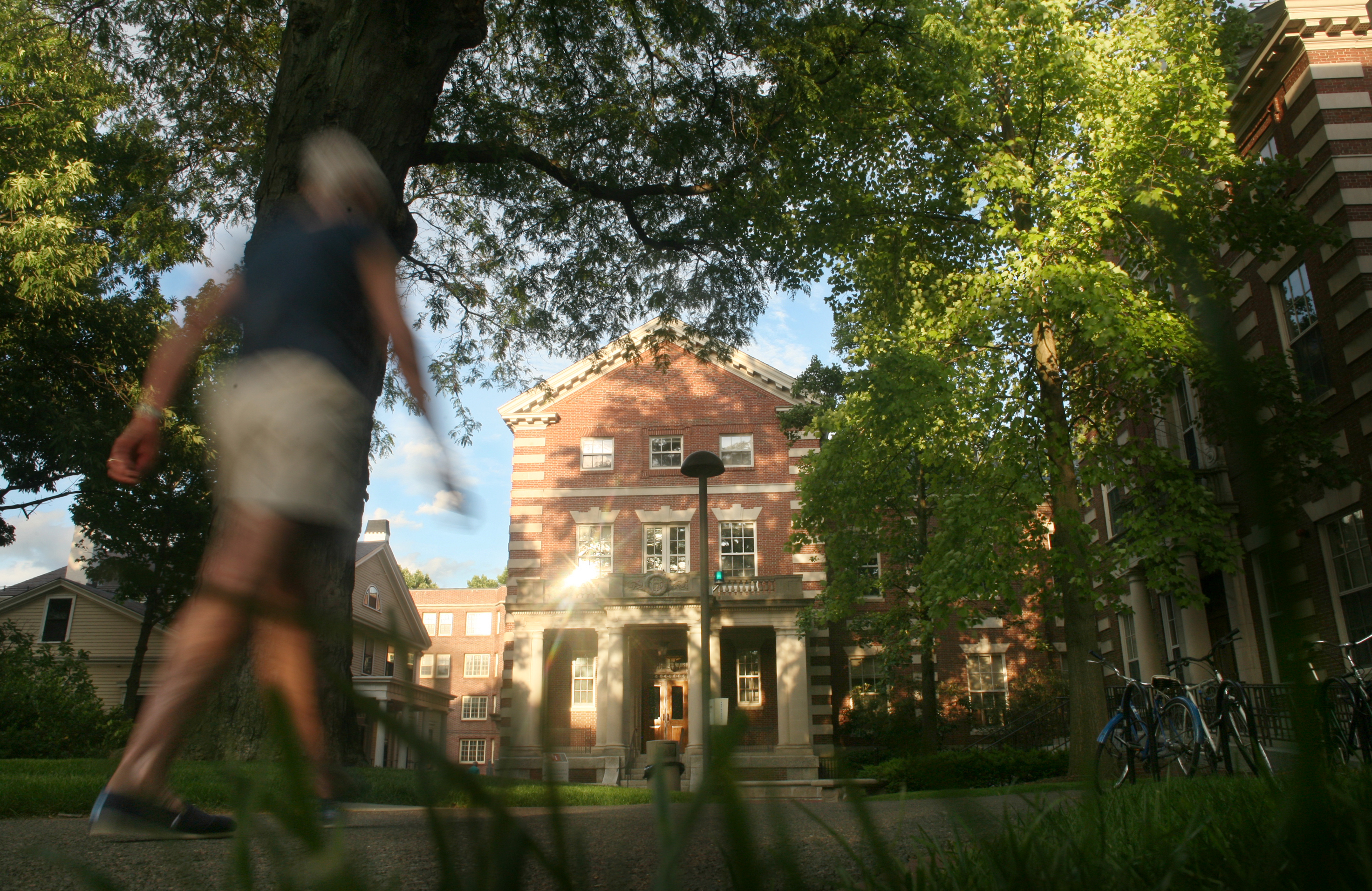
Photograph of the Mahindra Humanities Center by Tia Chapman
My Role
As the User Researcher, I designed the user research and usability testing plans, recruited users, conducted the research and testing, and analyzed the data.
I discussed insights from the data with the Center’s Web Designer, Graphic Designer, and Events Coordinator, and recommended changes to the design of the website and email newsletters.
The Challenge
As my office phone serves as the main phone line for the Mahindra Humanities Center, I noticed that support calls about our website overwhelmingly related to difficulties finding event information, videos, and livestream pages, as well as watching videos.
Given the degree of frustration expressed by callers, as well as the impact of these calls on the Center’s reputation and productivity, we decided to focus on and resolve these problems for our users.
The Approach
To better understand the experience of our website from the perspective of our core users, I reached out to faculty, staff, and students at Harvard who organize, share information about, and participate in the events and seminars at the Center.
I visited their offices and hangouts (on and off campus), depending on where they reported using our website. These contextual inquiries allowed me to observe and inquire about their physical and work environments.
During these visits, I conducted interviews about their motivations for and experiences with learning about and attending events at the Mahindra Center; their goals, needs, and impressions related to the website; and the way the website fit into their overall workflow.
I paired these interviews with usability testing of the website, focusing on the tasks related to event information, livestreams, and post-event videos.
The Discovery
Based on the contextual inquiries and interviews, I identified and created 2 personas to represent the core users of the Mahindra Humanities Center:
- William the Participant, who is interested in learning about and participating in the events and programs of the Mahindra Center
- Lisa the Organizer, who plans and publicizes seminars and related events at the Mahindra Center
Using these personas, I distilled the following insights:
Navigation and Information Architecture
The navigation and information architecture of the website suffers from ambiguity, but users still accomplish their goals.
Organizers, primarily staff, used the website at their offices on desktop and laptop computers to confirm the accuracy of posted event information, prepare financial paperwork, and gather information for sharing on their external organization’s mailing list and website.
Due to the focused nature of their goals on the website based on the specific program they were affiliated with, they often bookmarked the particular page(s) of the website they frequently used. When asked to complete tasks on other sections of the website though, they encountered multiple pain points.
Their experience highlighted the ambiguity of navigation labels, like “All Seminars” versus “Seminar Calendar,” as well as “Calendar” versus “Seminars” versus “Events.”
While this ambiguity did not prevent these users from accomplishing their program-specific goals, it revealed missed opportunities for spreading awareness of the full range of programming the Center offers.
Email Newsletter
The email newsletter serves as a primary touch point.
For participants, the website served as a secondary source of information, regardless of context and device, compared to the Mahindra Center’s weekly email newsletter.
Though they relied on the email newsletter more, they nonetheless found its comprehensive listing of all known upcoming seminars (throughout the whole academic year) in particular difficult to navigate and overwhelming. Furthermore, due to the alphabetical listing of seminars in the email newsletter, the upcoming talks of seminars with names in the latter half of the alphabet were cut off by certain email clients (which required downloading the removed portion).
Mobile Usability
Mobile usability is necessary for participants on the go to use the website.
As participants were primarily students and faculty, they were on the move on and off campus throughout the day—depending on their class, extracurricular, research, and teaching commitments—and often accessed the web via a mobile device. Unfortunately, they found the Center’s website difficult to use on their phones, given the lack of a responsive design, which contributed to their preference for the email newsletter.
Website Memory and Performance
The memory and performance of the website undermined the video player and livestream.
Especially in settings without a strong and stable internet connection, videos on the website uploaded slowly and in spurts, which rapidly created frustration and disinterest among users. In combination with past support calls that alerted us that the website crashed during peak activity times (e.g., after announcing a ticket lottery, or when livestreaming a popular speaker), we realized the memory and performance of the website posed a fundamental problem for the usability of the video player and livestream.
The Redesign
Business Constraint
User research and testing revealed the navigation labels and information architecture of the website suffered from ambiguity. Therefore, I recommended performing card sorting with users to design a more intuitive site map and layout. However, I received pushback from stakeholders, and ultimately it was not feasible to address these issues during this project.
Given this constraint, we decided to focus on the other avenues for improving the discoverability of and engagement with the website content.
Email Newsletter as a Primary Touch Point
The Events Coordinator, Graphic Designer, and I re-envisioned the weekly email newsletter as a primary touch point in the user journey map of the participant persona to learn about, attend, and watch events and seminars, rather than a calendar of all upcoming events in and of itself. By doing so, we focused on clarity, conciseness, and promotion of videos and livestreams.
Given the average length of time most participants planned out their schedule for, the redesign limited event listings to the current semester and seminar listings to a month out.
In addition, seminars were listed in chronological rather than alphabetical order, and livestream links were featured and highlighted as soon as they were available.
Finally, a separate email newsletter focused solely on announcing posted videos was branded and issued as needed.
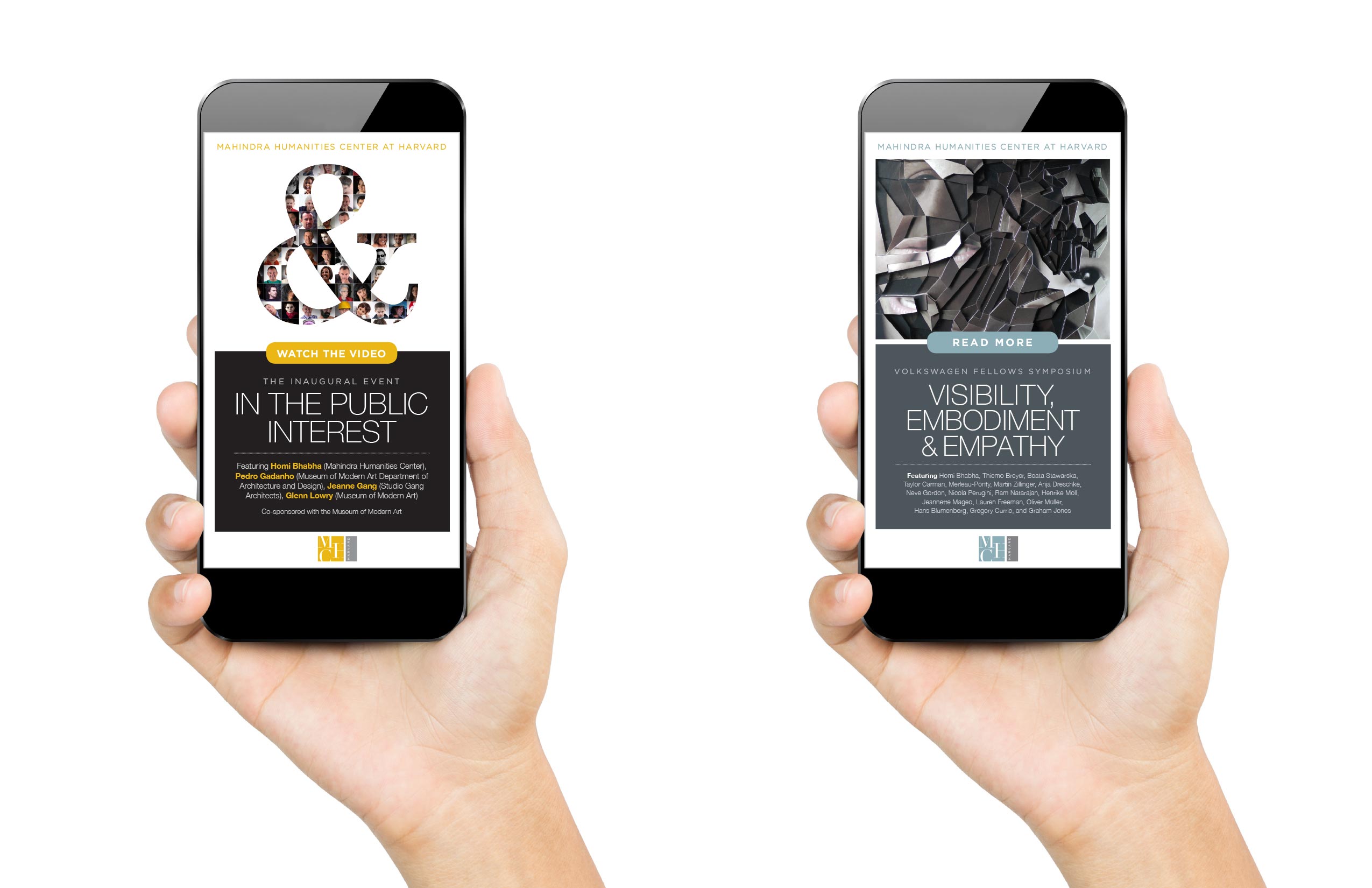
Mockups of the redesigned email newsletter for mobile to prominently feature videos and major events
Supporting Mobile Usability
To support mobile usability, the Web Developer created mockups for the website on mobile and tablet based on the existing layout. After I conducted usability testing on the mockups, he implemented the responsive design.
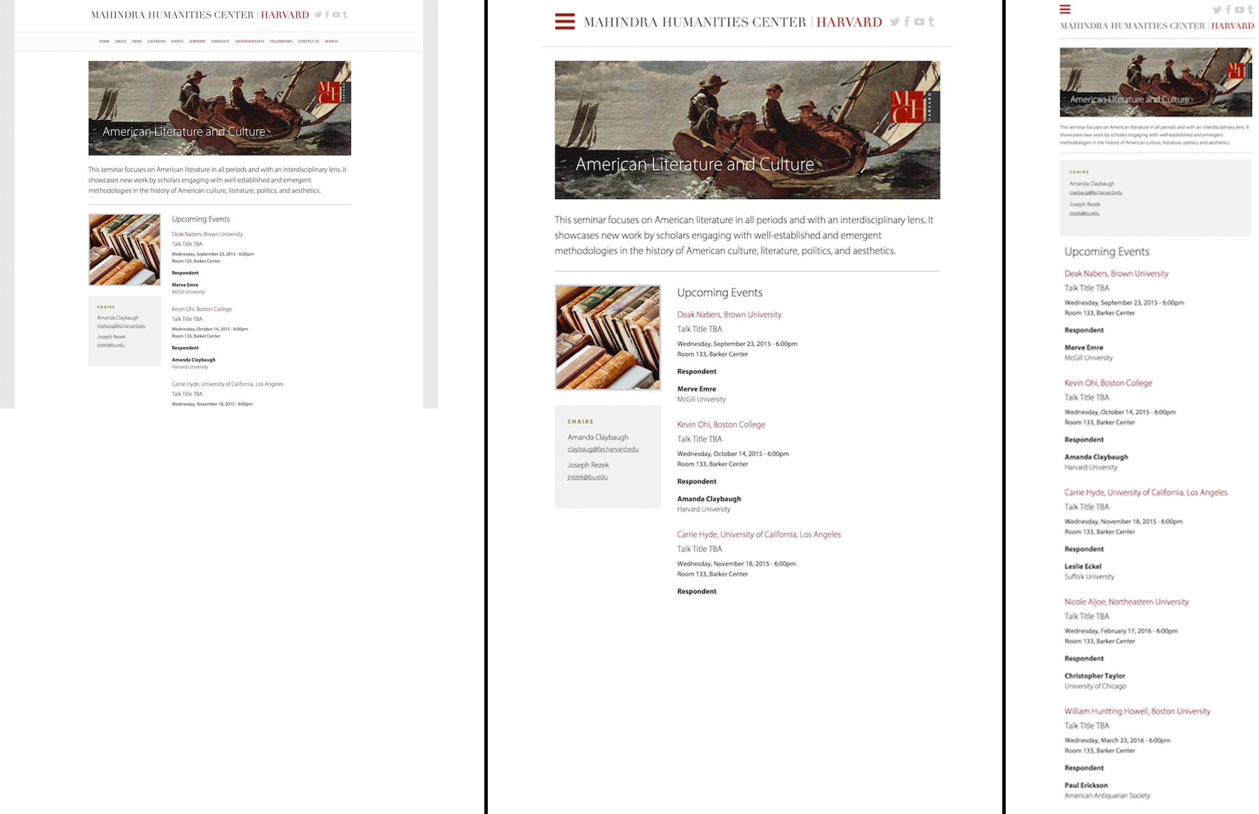
Mockups of the desktop (left), tablet (middle), and mobile (right) views for the responsive design of the website
Rerouting Videos and Livestreams
While our Web Developer implemented changes to both the content management system and server to improve the the memory and performance of the website in general, particularly with image optimization, we decided to use Youtube for our video and livestream needs. We began uploading our videos to Youtube and embedding the Youtube videos on the website due to the large file sizes of videos, as well as hosting livestreams on our Youtube channel.
The Impact
- Support calls decreased the following semester by 81%
- Video usage increased the following semester by 57%
- The website’s responsive design eliminated mobile usability issues identified by Google Search Console (previously 98% of the pages on the original website had “critical mobile usability errors”)
- The website’s responsive design increased the website's Mobile User Experience score to 99/100 according to Google PageSpeed Insight
Related Projects

GradeSaver | UX Research and DesignEnhancing the GradeSaver website with user research, usability testing, and design
Mahindra Humanities Center | UX ResearchLearning about and supporting the needs and goals of the Center’s audience and community
Seminar Posters | Visual DesignDesigning posters to promote the seminars of the Mahindra Humanities Center
Genetically Modified Crops in Japan | AnthropologyStudying Japanese consumer perceptions of and activist engagements with genetically modified (GM) crops in Japan
Jesus in Japan | AnthropologyLearning how the stuff of legend becomes a fixture of local culture