GradeSaver
GradeSaver offers essay editing services, free study guides, and membership to a database of literary quizzes and lesson plans.
Conducted between January 2015 and May 2015, this project sought to understand user needs and goals and resolve pain points on the study guide pages, essay editing service pages, and sample edited essay pages.

My Role
As the User Experience Researcher and Designer, I created the user research plans, recruited users, conducted the research and testing, analyzed the data for insights, and generated and presented all major UX deliverables to the client.
The Challenge
The client requested recommendations for optimizing the user experience design of the GradeSaver website in general, though he was particularly concerned with sections of the website that drove visitor traffic and thus ad revenue - namely, the free study guides that received the most traffic and highest scores of usefulness according to survey data.
The Approach
Diving into Survey Data, Analytics, and Trends
To understand the users of the website, I analyzed Google Analytics data and survey data collected annually since 2011 on user demographics and feedback about the website.
Given GradeSaver is not the only company that offers editing services and study support in literature, I also conducted a competitive analysis that included EssayEdge (which offers editing services), and Sparknotes and Cliff Notes (which offer study support in literature).
For a broader sense of the role and use of online resources for homework and research in middle school and high school, I reviewed a national study by the Pew Research Institute.
Fleshing Out Quantitative Data with User Research and Testing
To better understand the motivations, goals, and obstacles of users, I conducted interviews with high school English teachers about their experience with lesson plans and online study guides, as well as a high school student and college students majoring in English about their experience with online research for literature assignments and essay writing.
Following each interview, I asked users to perform a series of tasks either focused on lesson plans (for teachers) or study guides and essay editing (for students) on the existing website during usability testing sessions.
The Discovery
Personas and User Stories
Based on the quantitative and qualitative research, I created 2 core personas:
- Jessica the High School Student, who works hard to reach her academic goals, but requires extra guidance on literature assignments and feedback on her writing
- Michael the High School English Teacher, who is overwhelmed and lacks resources, but remains dedicated to developing creative and tailored lesson plans
User stories about each persona’s needs, goals, and desired solutions, as well as the results of the usability testing, helped to further distill the following insights.
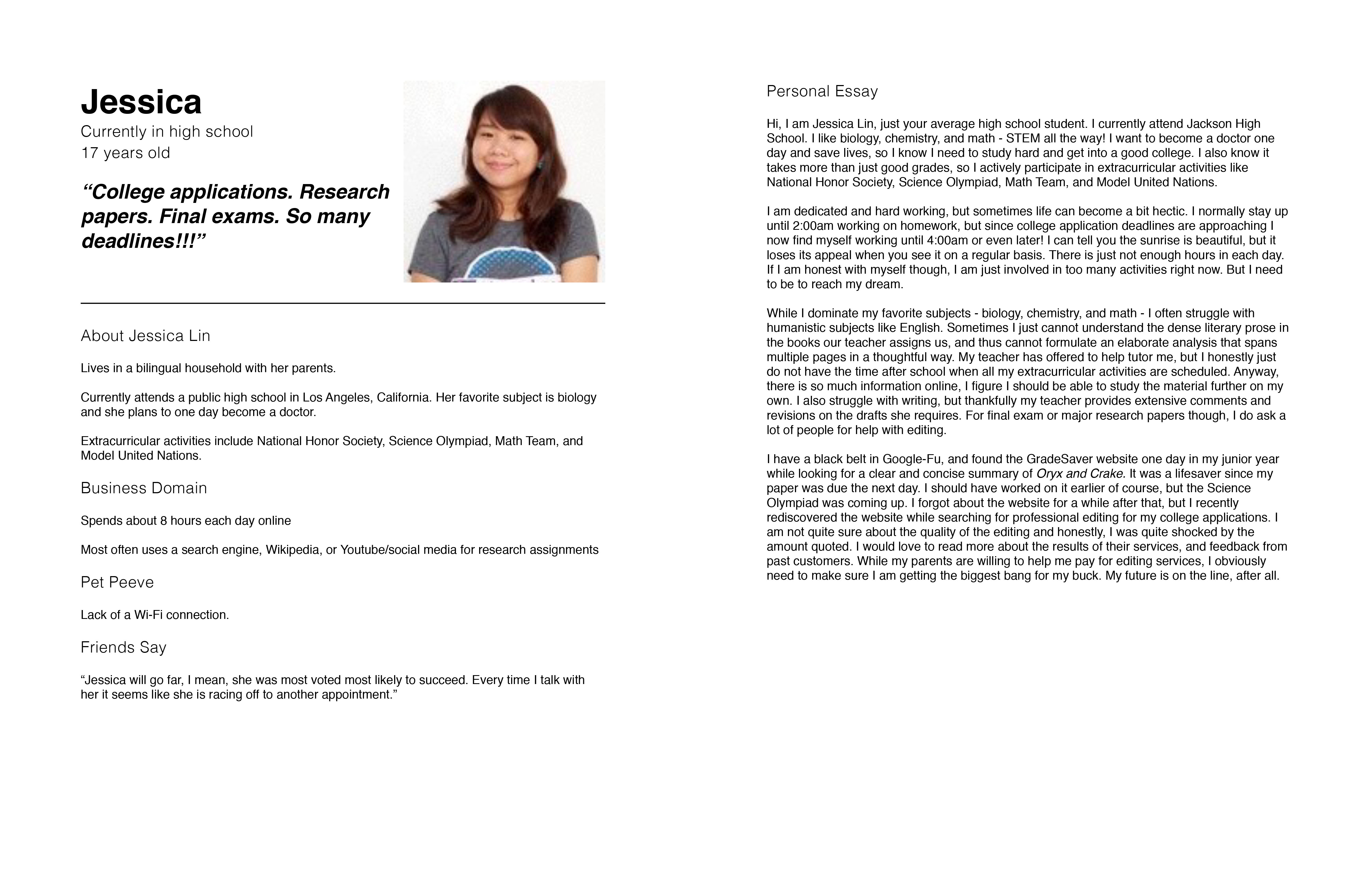
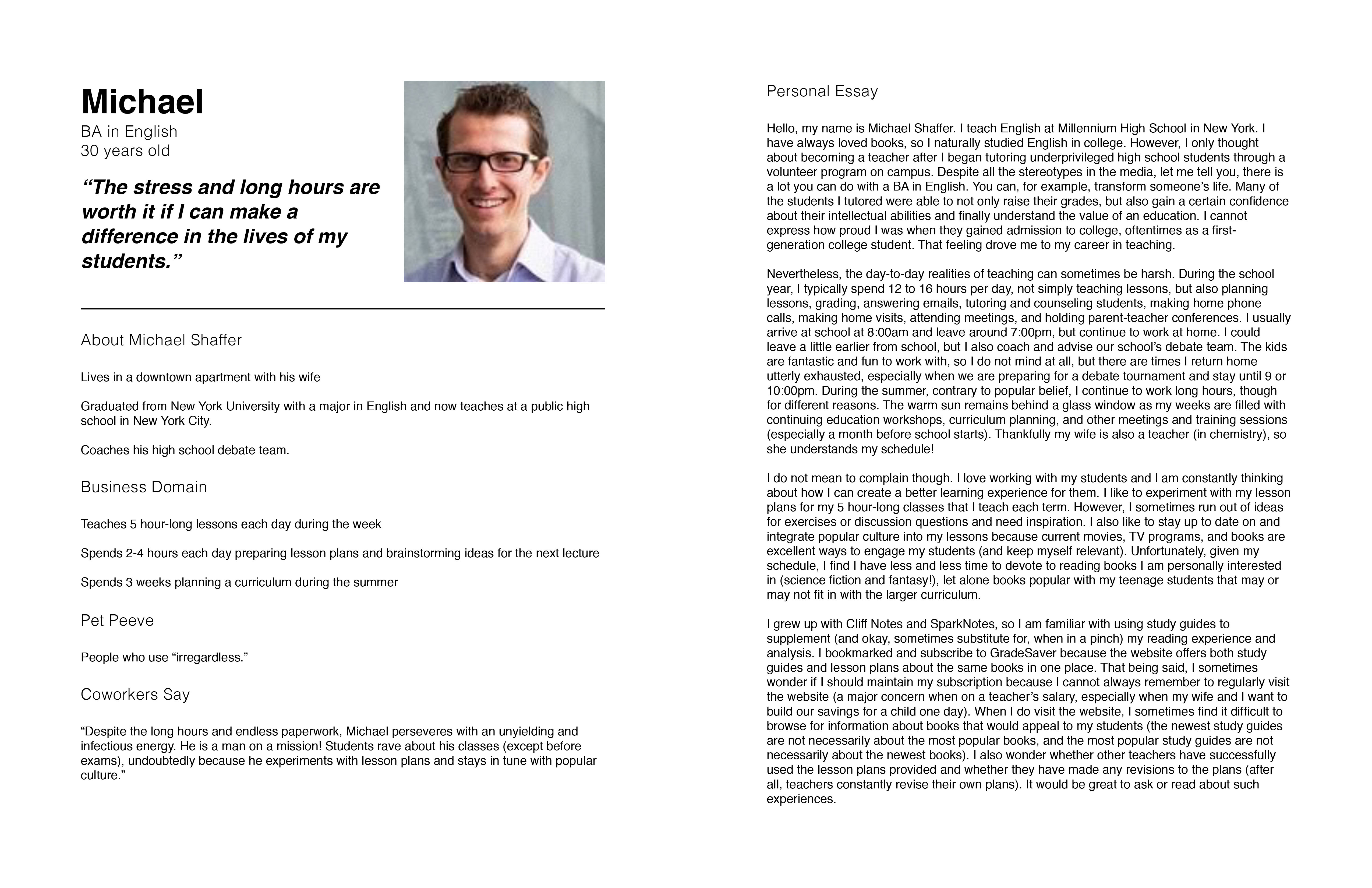
Personas and user stories for the 2 core users of GradeSaver
Teachers are Open to Recommendations for Lesson Plans, but Credibility is Key
Both new and experienced teachers rely on recommendations for activities, readings, and approaches to lesson plans, though new teachers often plan more extensively (so as not to forget anything during lessons). However, credibility is key. One teacher said he primarily uses online resources created by other AP and honors teachers for book recommendations.
Nevertheless, Teachers Look at What Their Students Look at
As one teacher explained, “All public teachers [officially] avoid Wikipedia, Cliff Notes, and Spark Notes. But in practice, I am going to look at those sites as well. Sometimes they have content that could be interesting and have new ideas. Teachers need to go through the sources that their students go to. More on the ball during lessons.”
For Students, Sources for Study Guides and Credentials for Editors are Key
Like teachers, students are also concerned about credibility.
For study guides, students expected to find useful and authoritative references (e.g., academic journal articles, respected critics) to support analyses of books. Students also mentioned they rely on abstracts and book reviews before checking out a full journal article or book, but these resources were not included in the bibliographies created by GradeSaver or its competitors.
For editing services, students wanted to know more about the credentials of the editors (beyond the fact that they are Harvard graduates) and to understand the editing process in detail. Ultimately, they want reassurance that the editing service will make more of a difference than entrusting their writing to a friend or family member.
The Redesign
Business Constraints
After discussing these insights with the client, we decided to focus on addressing user needs and goals and resolving pain points on the study guide pages, essay editing service pages, and sample edited essay pages.
I also discussed the lesson plan pages with the client. However, since the usability testing sessions of the original website did not reveal major pain points on these pages, and my key recommendation—to showcase recommendations and reviews from trusted pedagogical authorities to bolster credibility—was not a business priority, he requested focusing on the other identified pages instead.
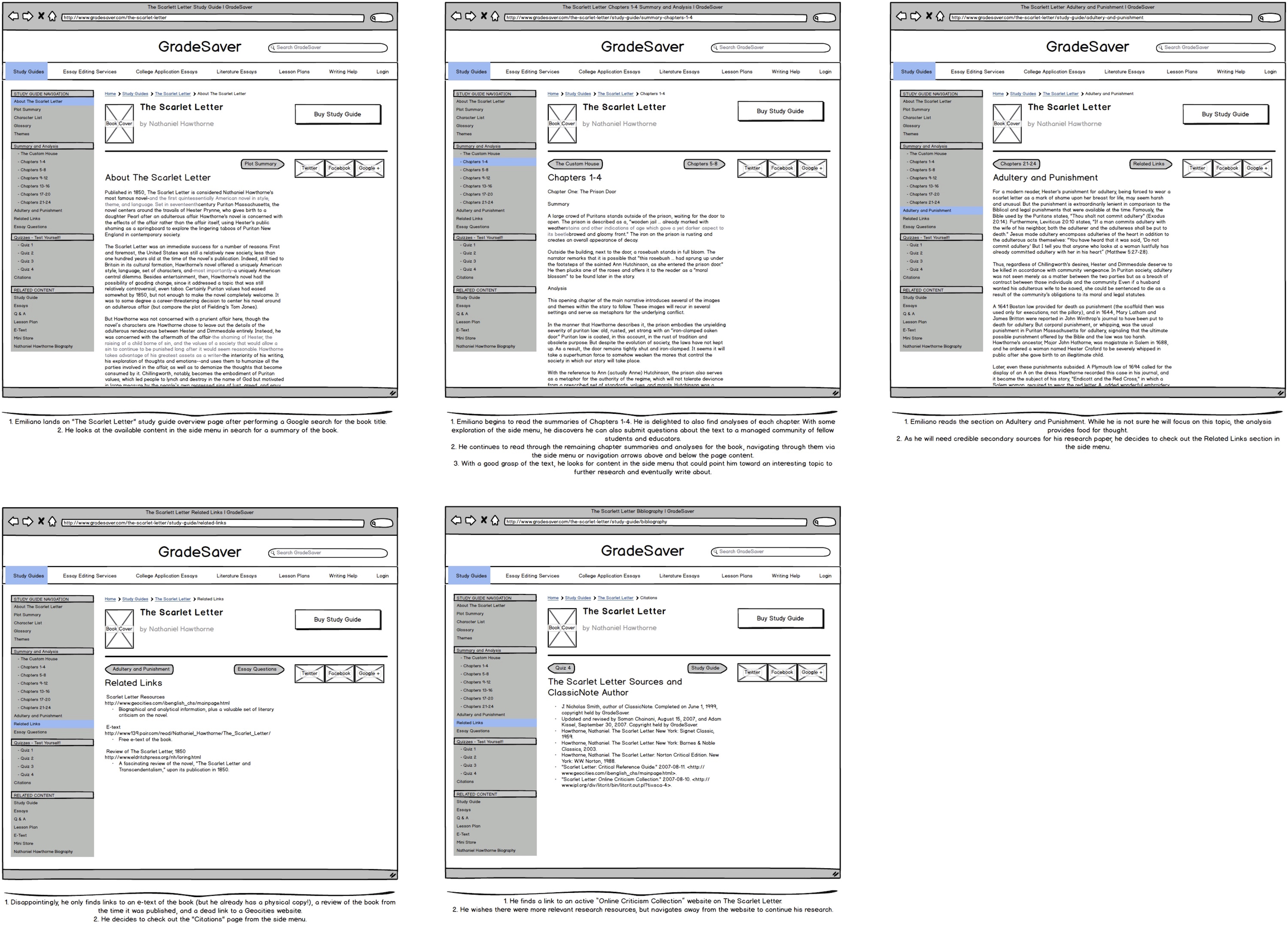
Wireframes for a scenario with the student persona using the study guide pages
Experimenting with Wireframes
I first experimented with design solutions through wireframes based on user scenarios.
STUDY GUIDES
In terms of information architecture, I reorganized the linked pages of and suggested new labels for the sidebar menu for clarity (e.g., “Further Reading” instead of “Related Links”), as users found the sequence and labels of certain pages confusing during the usability testing of the original website.
In terms of content, I listed links to abstracts and book reviews of cited references to assuage student concerns about credibility and provide convenience. I also included links to the associated lesson plans in the sidebar menu of the study guides, so teachers would know they exist and are available.
In terms of functionality, I recommended using a back-to-top button, given the length of pages with chapter summaries and analyses.
ESSAY EDITING SERVICE
In terms of visual design, I created a stronger visual contrast between the “Learn More” buttons (about different essay editing service packages) and surrounding buttons, as users did not notice the “Learn More” buttons during usability testing.
In terms of interaction design, I suggested using a button to highlight the option to view sample edited essays, given users struggled to find the link to the essays during usability testing, the prominent role the essays could play in contributing to the transparency and credibility of the editing service, and the constraint of not being able to feature biographical and/or professional information about the editors.
I also recommended allowing users to activate and collapse tooltips with hovering rather than clicking, as users became frustrated during usability testing when they had to click the tooltip to collapse it after they finished reading it.
SAMPLE EDITED ESSAYS
In terms of information architecture, I suggested labels to indicate the editing service package that was applied to the sample essays in order to help users understand the differences between the editing service packages and decide on what level of editing service they require.
In terms of interaction design, I created a sidebar menu that divides the sample edited essay into sections (i.e., original essay, editor comments, and editor revision) and allows users to more easily navigate through and find desired content. During usability testing, users found the original layout took too long to scroll through.
I also included a button on each edited essay sample page that highlighted the type of editing package applied to the edited essay sample and led to a prefilled form to purchase that same editing package. Doing so created a smoother and more direct way to navigate to the order form, rather than breadcrumbs or the back button on the browser.
Refining Solutions in Mockups and a Prototype
After performing another round of usability testing, I refined my solutions in mockups and created a clickable prototype.
The Impact
I presented my design recommendations and major UX deliverables to the client and his marketing team, who planned to incorporate my solutions in a future iteration of their website.
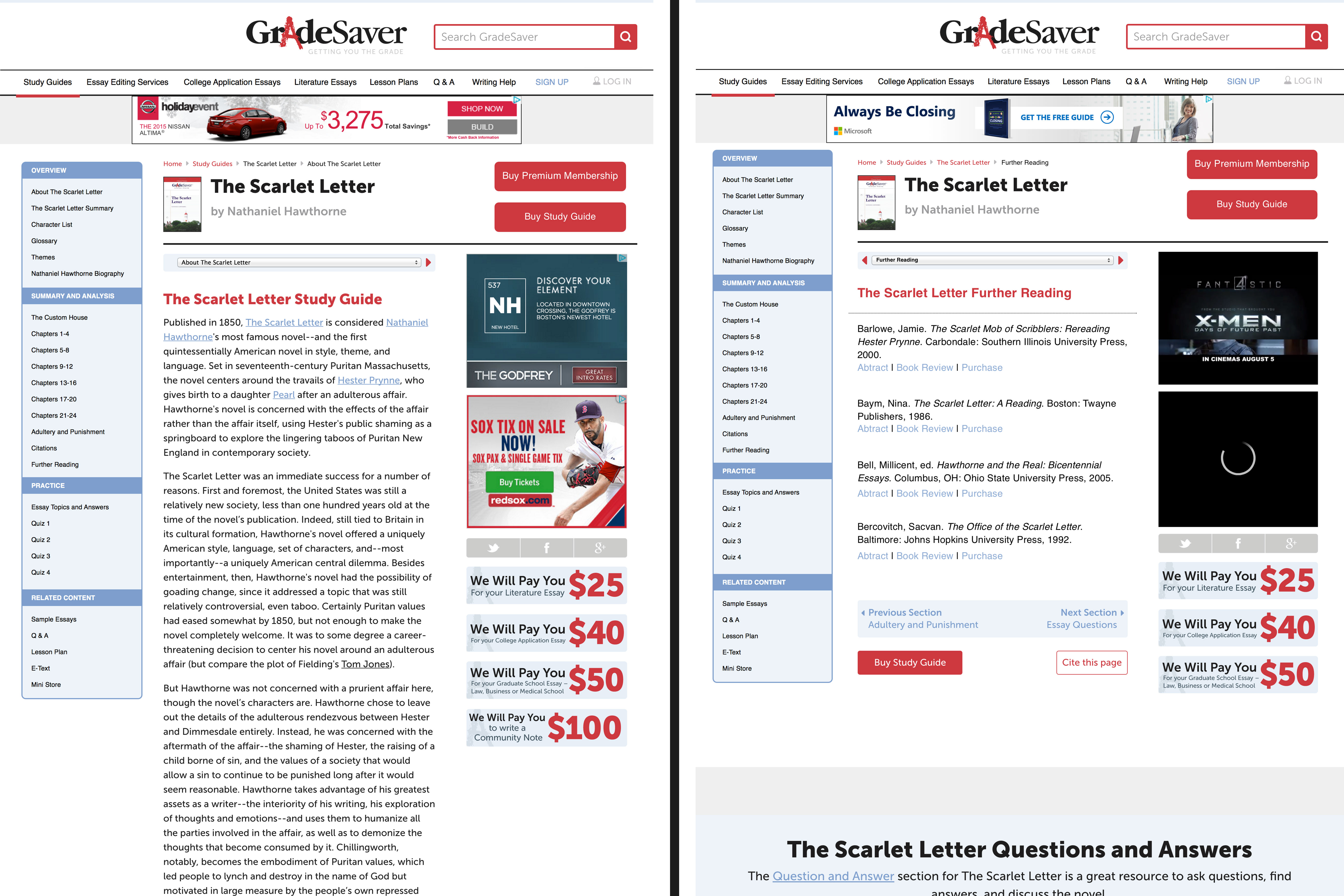
Mockups for the study guide pages
Related Projects

GradeSaver | UX Research and DesignEnhancing the GradeSaver website with user research, usability testing, and design

Mahindra Humanities Center | UX ResearchLearning about and supporting the needs and goals of the Center’s audience and community
Seminar Posters | Visual DesignDesigning posters to promote the seminars of the Mahindra Humanities Center

Genetically Modified Crops in Japan | AnthropologyStudying Japanese consumer perceptions of and activist engagements with genetically modified (GM) crops in Japan

Jesus in Japan | AnthropologyLearning how the stuff of legend becomes a fixture of local culture